Website Redesign & Metadata Accessibility
Redesigned the CELA website for improved user navigation and enhanced accessibility in metadata presentation, ensuring equitable access to digital library resources for users with print disabilities.

My Role:
UIUX Designer

Team:
Experience Design for Accessibility (ED-A)

Timeline:
12 weeks, 2024

Client:
Centre for Equitable
Library Access (CELA)

Web Redesign
Capstone Project
Background
CELA is a national non-profit organization that provides accessible reading materials for individuals with print disabilities. However, their existing website had accessibility barriers that created friction for users, especially those relying on screen readers or assistive technologies.
Challenge
How might we redesign CELA’s digital experience to support more intuitive
browsing, personalization, and equitable access for users with print disabilities?
Deliverable & Impact
Redesigned and tested a user-centric prototype that included:
-
Screen-reader optimized information architecture.
-
Redesigned, simplified homepage, revamped filtering
system with personalized search preferences. -
UI cards with audio sample previous for narration quality.
Challenge
Navigating the CELA site is slow and confusing for users with print disabilities
Through interviews, usability testing, and site audits, I uncovered major usability pain points:
-
Screen readers detected irrelevant or confusing links.
-
Users struggled to find and customize search filters.
-
Book previews were inaccessible until after download.
-
Homepage layout was overwhelming, especially at high zoom.
This fragmented experience limited independence and satisfaction for users who rely on accessible design.
Proposal
Building a streamlined,user-first accessible library experience
Our approach focused on four major redesign areas to make the website more intuitive and empowering for its users.
1. Accessible Information Architecture:
Simplifying the IA structure so fewer keystrokes are required, prioritizing high-traffic links, and streamlining the sitemap.
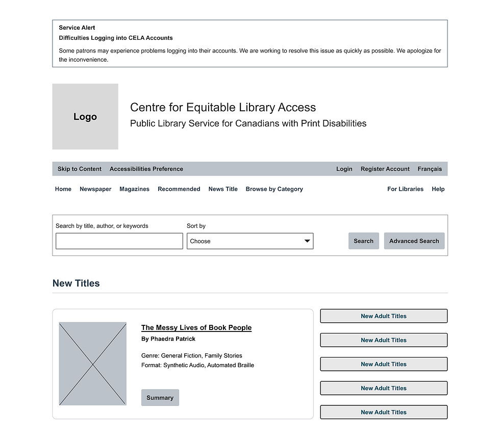
2. Homepage Redesign:
Organizing the layout with fewer and cleaner elements. Emphasizing user-requested content such as "New Titles",
and improving visual clarity for screen enlargement.
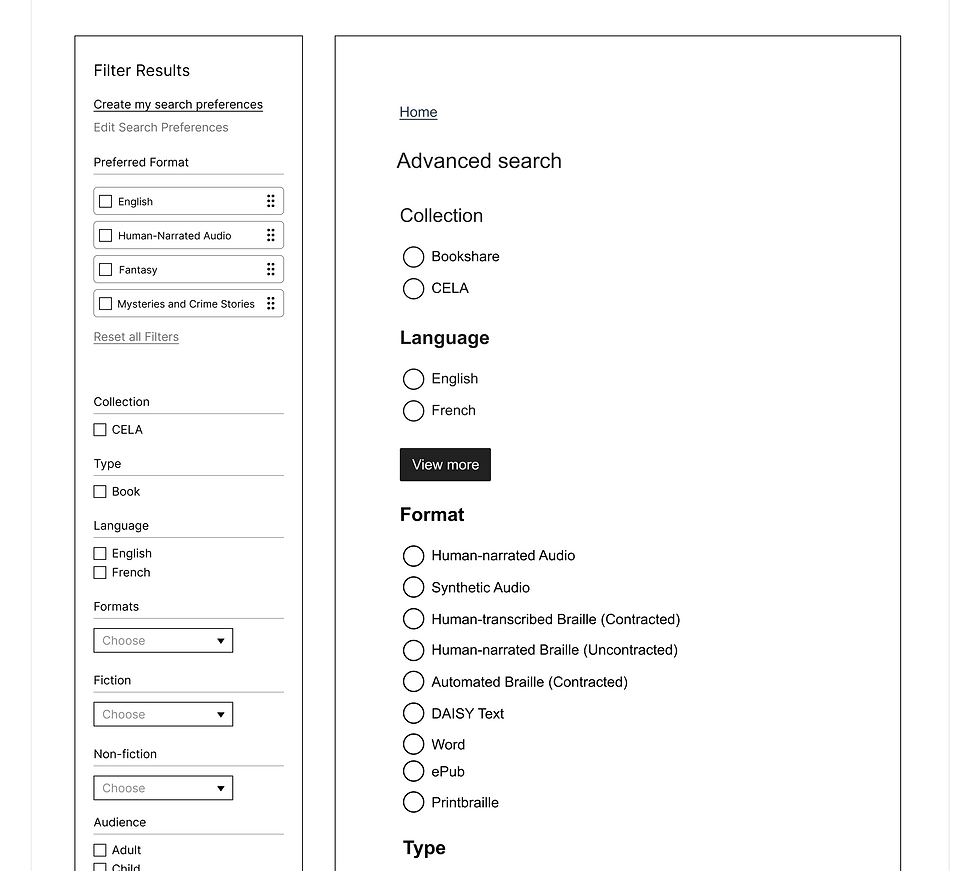
3. Personalized Filtering System:
Introducing a "Preferred Formats” section. Adding hyperlinks to “Create/Edit Search Preferences”, and reducing unnecessary page refreshes.
4. Audio Sample Previews:
Enabling users to preview audio narration directly on UI cards. Addressing a critical pain point with minimal UI disruption. Finally, created long-term vision for API
integration and licensing.
Potential Benefits
Improved Accessibility Compliance:
WCAG 2.1 AA-compliant metadata layout using semantic HTML and ARIA attributes for screen reader compatibility.
Scalable UI System:
Modular components for filters, book cards, and pagination that can be reused across categories and devices.
Easier Metadata Scanning:
Reorganized metadata into prioritized, digestible chunks (e.g., reading time, availability, format type) for faster decision-making.
Efficient Navigation Flow:
Unified structure for browsing by genre, format, or keyword with minimal cognitive overload.
Design Process
1
Conducted brainstorming
session to align ideas with impact and feasibility. Narrowed to: homepage simplification, filter customization, book preview improvements.
2
Conducted current state audit using heuristic evaluations and simulating the site using screen readers to pinpoint key issues.
3
Created both low and high fidelity redesigned site prototypes on Figma, aligning with CELA’s visual system and adhering to WCAG guidelines.
4
Accessibility testing was conducted, and some challenges were highlighted in our prototype.
Issues were: improper reading order, unresponsive frames.
This guided design refinement for future testing.
5
Usability testing was conducted with users who have print disabilities. Screen reader compatibility remained a challenge, but feedback received validated the overall structure and navigation improvements.

Ideation board for website redesign

Prioritization grid of all redesign ideas
Wireframes of proposed website redesign
Deliverables
Homepage and Audio Sampling of Book

This flow showcases the user on the homepage, where they navigate to "New Audio Books" to sample an audio book.
Filter Preference Settings
This flow showcases the user on the homepage, where they input a search and receive no results.
The user then navigates to filter preferences to edit their set filters, and is able to find their results.
Information Architecture Maps for In-Depth Structure View

Information architecture map of original search results page.
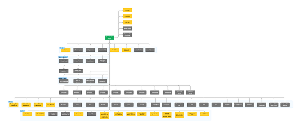
Information architecture map of redesigned search results page. Yellow tiles indicate new entry points added.
Impact
"It was so much easier to find the audio bookos I like without having to guess the narrator's voice."
-User with Print Disability, Testing Session in Feb. 2024
68%
Participants rated the new site "easier to use"
22%
Decrease in user drop-off
at the book details page
47%
Increase in task success rate during accessibility testing
Reflection
Designing for Accessibility isn't Just About Compliance; it's About Clarity, Respect, and Usability for Every User
Throughout the CELA redesign, I learned the importance of starting with structure and meaning first, rather than visuals. While I initially explored complex filtering systems, I quickly pivoted after realizing that too many options would only overwhelm users.
Co-creating with users who use the platform every day has been an incredibly invaluable experience, teaching me that no audit can bring the insights that individuals bring to the design process.
Designing with assistive technologies in mind from the start is crucial, if you want to prevent backtracking late down the road!